Showing posts with label graphic design. Show all posts

Saturday, March 08, 2014

Christian Tagliavini - a fantasy world of paper and cardboard

 
There are some creative people that stand out in your mind, above all else, with their ability to make something that speaks directly to your inner self. One artist like this is Christian Tagliavini, a graphic designer and photographer. I had seen Tagliavini's work many times in the past on-line, marvelling at what he does using cardboard an paper to create elaborate costumes that dress up his models accordng to the concept he is working on at the time. A recent encounter with some of his work up close, remined me of his extraoidrinary talent again, and I thought I would share it with you.


He is Swiss-Italian, educated in Italy and Switzerland, where he lives and works as a photographer. This provides him the perfect frame and background to invent, create and totally produce images that blend fine arts and craftsmanship. Christian Tagliavini loves designing stories with open endings (requiring the observer’s complicity) on unexplored themes or unusual concepts, featuring uncommon people with their lives and their thoughts made visible. This rich and exciting collision of circumstances results in his exquisite photos. he has received numerous international awards and has exhibited his work all over the world. his latest show was in Berlin in 2013.

 
I love the photographs he creates as well as the incredible costumes. He makes them himself using mainly paper and cardboard, printed, cut and glued in intricate ways, bringing to life fairytales and forgotten worlds. I'd love to have one precent of his creativity to make stuff like this for my fashion dolls.


Saturday, January 07, 2012

Interior design workshop in Athens


It's humanity's nature not only using and shaping it's surrounding space but also fill it with beauty and meaning. By using the term interior design we describe that group of projects that are about transforming an interior space into an effective environment for the spectrum of human activities taking place there. 

Designers and interior architects have defined the relationship of humans and their environment based on psychological and natural parameters, with the purpose of improving their quality of life. This procedure delivers economic, functional, aesthetic and social advantages and in that way provides strategic thought, which aims into the multifaceted performance of an investment. 

The first ESO, a workshop dedicated to interior design, wants to gather the creative society of these designers so as to introduce their work to us and also their dynamic, their thoughts and perspectives. We will be able to see the way in which it develops and draw conclusions about its place in Greek reality.

The speakers panel for ESO, which will take place at the Onassis Cultural Centre on the 7th of February is: 

- Maria Vafeiadis (mkv design) Key Note Speaker  
- Zeppos - Georgiadi (zege)
- Babis Ioannou (ISV)
- Dimitris Karampatakis (k-studio)
- Memos Philippidis (mplusm)
 
Presenting: Giannis Douridas, Architect   |  Pecha Kucha Athens


Distinguished graphic designers will take part in the workshop with short intervening presentations. They will examine the relationship between graphic and interior design.

The art direction and design of the ESO communication is by Stage Design Office. Soon there will be more information. Due to the limited number of seats, please reserve your seat soon here.

The workshop is organized by the magazine +design in collaboration with ARCHISEARCH.gr

Friday, January 21, 2011

Tetragon brochure in Russian

My first real brochure design for Tetragon is one in Russian, made to be distributed in an exhibition in Moscow. It is a fourfold and was printed in 200 gr velvet paper. 


Wednesday, December 08, 2010

Thessaloniki Graphic Design 1980-2009


Click on the image to see the details of this extraordinary show 

For non-Greek speakers:
Tonight, at the Centre for Contemporary Art of Thessaloniki, Red Creative presents their book about Thessaloniki's graphic design history from 1980 - 2009, as a reminder of their 20 year anniversary. The event begins a 19.30

There will be a seminar dedicated to it on Saturday 11th of December, from 11:00-15:00 at the Centre. Speakers are Dr. of Typography and Graphic Communication Klimis Mastoridis, designer and typogrpher Aggelos Bakas and publisher Manolis Savvidis.

Tomorrow, 9th of December, a poster show accompanying the edition opens at the Centre, lasting only 4 days (closes on Sunday 12th of December). The show is curated by the Centre's director, Syrago Tsiara.

Tuesday, February 09, 2010

A call for Greek designers

A few days ago I received this great e-mail from the well known in Greece CARTECO company, inviting the Greek designers from every section to sell their products through a dedicated website. I think it is a great opportunity so I post their "invitation" here:

CARTECO addresses an invite to GREEK industrial designers, graphic artists and artistic groups, who produce their products in small or large scale, manufactured, handmade or not, to a limited number or to order, and have a given business policy, to submit product details and information such as pictures etc. for sale in Greece and abroad through the new on-line store CARTECOSHOP.GR, which is under construction and will be soon on line.


The deadline is the end of February. It is not mandatory for participants to have a comprehensive collection or refined presentation, but certainly this will help. What interests us is for them to be able to guarantee quality and good design of the product and be consistent with our company and consumers. Be careful, we do not want to experiment with your ideas for the first time. We want ideas that are implemented and ready to fall in the market and become known to consumers. The product categories are general, i.e. objects, lighting, furniture, artwork, gifts, jewelry, silk screens, posters, textiles, etc. There is no restriction. Just be sure to get us all the necessary information quickly and to make us understand in as few words as possible exactly what it is that you do. The sales agreement for your projects through our website and our network is NOT exclusive and is not binding for any reason without any written agreement. Failure to accept the sale of products through our e-shop does not mean anything about the quality or the level of your work. We just cannot accept all the proposals or to cooperate with everyone. The products will be delivered to us finished, ready to pack for sale. Our company does not intend to enter a process of production, research and development of your project. If you are interested in selling or promote your products through our network, send us by e-mail to vpbartz@gmail.com the following:

  • Black and white photograph of the designer or group
  • Name and surname of the designer and the team
  • Contact details, telephone, email, website or blog, Address.
  • Small biography, information about previous activities, projects
  • Products that are likely to be released or sold in our market or other shops. Up to 10 photos for each product that we propose for sale in our online store at the required resolution. Variations of the product. Potential variety of colors, versions, designs, etc. Product description, dimensions, materials. Delivery time by order of the day and whether there is a minimum order. Method of payment to you, your team or manufacturer.
  • Sample if available (if in the end you are picked for the shop, you will be asked for one)
  • Category sales and use, eg Artwork, sculpture, gift, furniture, etc
  • Jpeg low resolution images (for web) in 2 sizes: 114X114 pix and 222X222 pix
  • Text (in 2 languages): 250-300 words (1500-2000 characters including spaces)

Once selected, we will contact you to discuss the details of our cooperation and to require additional material to be posted on the website. Thank you very much for your attention and interest in cooperation.

Sunday, February 07, 2010

Design Walk 2010 ends today!


Today is the last day of Design Walk 2010: The Design Walk consists of studios opening their doors to visitors, inviting them to follow a walk that brings them closer to the most functional and everyday applied art. The initiative was started by a small team of graphic designers that spotted the opportunity to trigger a profound dialogue between the graphic design studios of that particular neighborhood and the public. The Design Walk is in conjunction with the Greek Graphic Designers Association. The walk now attracts thousands of visitors each year.

Bios

The walk takes place in the vibrant area of the city next to the Acropolis, leading the visitor between cult shops and hip bars to discover works by award-winning graphic designers, in one of the most inspiring neighbourhoods in Europe, where ancient Greece, West, East, yesterday and tomorrow meet. For the 2010 walk, double decker, the London-based curating agency, is challenging 13 Graphic Design Studios to create a piece of work inspired by the contradictions / oppositions with which every designer has to deal, and which arise from fundamental questions in design methodology. The resulting exhibition, POLES APART, will give a unique visual insight into the creative process – as well as its curious contradictions.


g

Participating designers will create a piece of work based on the following dichotomies:
1. Void vs. fullness 2. Noise vs. silence 3. Beauty vs. Ugliness 4. Interesting vs. boring 5. Thin vs. bold 6. Word vs. image 7. Symbolic vs. literal 8. Landscape vs. portrait 9. Positive vs. negative 10. Anarchy vs. order 11. Digital vs. analogue 12. Foreground vs. background 13. Original vs. copy


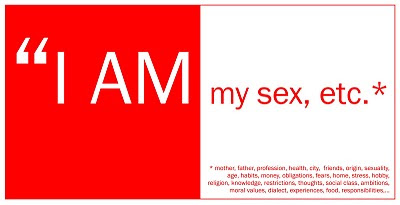
I AM Design

Instead of settling for just one side of the dichotomy, the designers will incorporate both into their work and use them as creative fuel, with no restrictions on medium or scale. Visitors will be further engaged by talks, screenings and educational activities.

Unfortunately I could not be there this year but will have photographs and a report in the next days!


Thursday, February 04, 2010

One Man Show's promo kit arrives - and it looks smashing


One Man Show, or better known to me and his friends as Tassos Papaioannou, is a very talented illustrator/graphic designer/decoration designer/comic artist/comic publisher/radio producer/DJ (phew what a list!). He is one of the few Greek illustrators included in Taschen's yearly edition "Illustration Now! Vol.2". His work has been featured in many prominent greek newspapers and magazines, he has designed logos and graphics for many greek companies, done studio sets for MAD TV channel and has been the man behing Giganto Books comics publishing house (as well as an established comic artist himself).


He is working freelance now and send me his promotional package, which you see in his photos. It features a series of cards in various sizes, printed with illustrations that he has done over the years, accompanied by various favourite quotes. All of this is enclosed in a silver foil semi-transparent envelope. I love his work and I hope you will like it too! You can contact him here and read his blog here.

Photos are by OneManShow

Saturday, December 12, 2009

Panorama Design 12th & 13th of December 2009


The sixth edition of Panorama Design, is organized by bi-monthly magazine +design at the Art Centre (Garyttou 53, Chalandri, Athens) on the 12th & 13th of December 2009. This is the most successful institution of its kind in Greece. Tickets for previous years were sold out days before the start of the two-day conference. It's success is due to the quality of all events organized by +design magazine and to it's simple yet complete concept: Creative people of every stature and dynamic (from the multinational ad agency to the lonely freelancer), from across the spectrum of visual communication (advertising, publications, branding, Internet, illustration, multimedia, etc.) in Greece. And apart from getting together, they talk, do presentations of their work and post their thoughts about the market's reality.

This year's event includes as usual two important foreign speakers, an element that completes in the best possible way the look of a "full schedule". Furthermore, on Sunday, before the start of the regular programme, a meeting will be held with themes of informative and practical content for the creative community.

What about the covers? no.9

For 2009 - Mika - The Boy Who Knew Too Much


Richard Hogg, Zuleika Penniman(Mika's sister) Da Wack(his other sister, Yasmine) Claire Bushe and Sophie Blackall did some the illustrations again for Mika's 2nd album. But the main one responsible for the look of it is of course Mika himself. While I do like the style, it does not distinguish it from the previous one at all; in fact, when I first saw it, I thought I was seeing the old one. So no originality there, but instead, I like that he is so creative he does his covers as well. Here is what he has to say about the packaging of his album:Speaking of packaging, I write to you from my paper laden desk that I have not allowed anyone to clean for over 7 weeks. Its covered in bits of art, drawings, cut outs, samples... all prep work for the new album art. Its being done much the same way as last time, by my sister DaWack, Richard Hogg and I. As many of you know, over the past few months I have been purging visual references from children's picture books, from the 40s to the 70s. There's something dark and magic about a good picture book. The way those characters never leave you and attach themselves to a particular time of your life. The only thing I can compare it to is smells. I was once nearly kicked in the balls on the street for asking a complete stranger what perfume she was wearing. When she asked me why I cared, I told her it reminded me of this bitch at school's mum who told on me after I was caught stealing her
daughter's stationary when I was 7.

The new artwork, is well, odd, rather amazing but gloriously weird. Suffice to say I'm rather excited about it. We will be adding new babies to our family. Hairy babies. Ha!


For the 00's - Bat For Lashes - Two Suns


Another artist who does her own covers! Art direction and concept for the album is by Natasha, as well as the booklet artwork. The cover was photographed by David Benjamin Sherry and the sets were designed by Tony Hornecker (he does amazing sets and has done Kylie's X album photo shoot sets among others). Graphic design is by Andrew Murabito (he has done almost EVERYONE) and the photographic production was done by Dan Sanders. The digipack version (above) is the best. The whole affair conjures an otherworldly atmosphere, perfectly expressing the concept of Natasha's music.

Friday, December 11, 2009

What about the covers? no 10

For 2009 - no.10 - Röyksopp - Junior

The last sketch is unused art from Leslie David

Well, the photo on the cover is by Stian Andersen, who has done quite a bit of album cover photography in Scandinavia (A-ha anyone?). The rest of the photographs are from Jan Alsaker, Paul Wesley Griggs and Samantha Rapp. But the star here is Leslie David, the graphic designer behind the whole thing. His work is reminiscent of the 80's but with a contemporary vibe. And he is one of the artists that still puts pencil to paper and that counts a lot for me.


For the 00's - no.10 - Morrissey - You Are The Quarry


First of all I think this is the first time Moz appears dressed in a suit on an album cover. Secondly the title is not in quotation marks for the very first time in one of his albums. He looks like an American mob member, brandishing a Thompson sub machine gun, which is the typical weapon of everyone in the prohibition era, also known as the Tommy Gun. The logo of the record company (Moz's own) is the same gun, black on pink except on the cover. The photo is taken by the famous photographer Greg Gorman. Gorman prefers working in black and white so it is a bit of a departure for him. There is a version with grey instead of pink background used for the Deluxe Edition of the CD.
Apart from the cover though there is not anything worth mentioning from the rest of the album design - there is none. Simple lettering and colours (yellow inside, pink outside). The design credit goes to Morrissey along with Scott King (who did Roisin's "Overpowered"). They probably got tired after doing the cover and called it quits. Shame.

Thursday, December 10, 2009

What about the covers? no 11

For 2009 - Montt Mardié - Skaizerkite


Patrik Berg designed this one. The title means a person suffering from hybris and was also the name of a New York gang from the 40's (aka Sharp Boys). Both definitions fit with Monty's image of course. The design is simple and minimal, with the photograph of the front cover standing out. The packaging is a gatefold carton.


For the 00's - No.11 - The Organ - Grab That Gun


This cover reminds me a lot of Piet Mondrian paintings. The graphic design is by Randy Iwata, Jenny Smyth (group member-organ), Mo Salemy, a Vancouver-based artist and David Cuesta, a Canadian designer.

Wednesday, December 09, 2009

What about the covers? no 12

For 2009 - No.12 - Yeah Yeah Yeahs - It's Blitz!

vinyl sleeve art front/back


vinyl inner sleeve art

AllMusic in it's review of the album says "It's Blitz!'s images of a woman's hand bursting an egg and fleshy tomatoes and mushrooms spread across an otherwise empty pizza box are surprising, immediate, and strangely sensual, and that goes double for the actual music". Indeed. The photography by David Belisle is what makes this album cover stand out from the rest this year, probably making it cover of the year. And by spot-varnishing the egg splash, they make it stand out even more! The inside of the album looks like a pizza box with the cd itself being the pizza and the band member's heads replacing mushrooms and stuff on it. There are also some photos by Autumn DeWilde and Eric Uhlir. Art direction is by Seb Marling and Karen O.


For the 00's - no.12 - Underworld - Oblivion With Bells


inner concertina Japan

inner concertina USA


inner concertina UK

John Warwicker is the art director on Oblivion. His company, tomato, is responsible for some of the most inspiring design around us today (check their projects and you will understand what i 'm talking about). The inner sleeve is a concertina which had different inner images according to the country of issue (europe, japan, us). The whole feel is perfectly co-ordinated with the music inside the cd, urban, atmospheric, modern. The tomato team also does Underworld's video clips.