


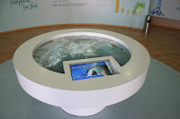
And first of all the Attikon Metro (Athens Underground) stand. Of course it was centred around the Thessaloniki Underground line that has just started construction (wonder when it will finish). It was the first time we did their stand. They always have one of the best stands in the fair, so we were up to a challenge. My colleague Ioanna Papadopoulou did an excellent job and I think it was the best stand we had in the fair. Sleek, minimal lines, delineating speed and class. Few colours (mainly white and grey) with the addition of blue, which was originally lime green but changed after a firm "request" came from the Ministry for the Environment, Physical Planning & Public Works. The mirror at the far wall of the stand (where you can see me taking the picture!) combined with the glass wall with the plasma screens enclosed produced a stunning effect.It got an award for best design for indoor stands.


The stand for the Organization for Labour Care was designed by me. I also designed all the graphics that were in it apart from the wave background at the far wall of the stand (the one behind the plexiglass columns and the old ladies). They wanted a seaside feel (graphics - plexiglass mock sails - colours) combined with elements of a playground (colourful "children' furniture) and culture (the plexiglass columns). I think I managed to combine all of them without making it look clumsy and overstuffed. The ceiling has white fabric with back light, to create a nice atmosphere at the TV area, without glare, making it easier to watch the projections. The glass floor you can see was filled with sand, pebbles and sea-shells.


The Institution for Social Security stand was again designed by me (I had done their stand last year too). It was a happy collaboration, with both us and the client very happy throughout. Graphics were designed by my colleague Natasha Masadi. The original colour of the blue wall was lime green (and the floor orange) but the powers that be decided on using blue. The slanted element at the facade is covered with aluminium panels.


The National Telecommunications Organisation stand was a big attraction. Designed by Ilias Papadopoulos, a senior partner in Tetragon, it had an indoors as well as an outdoors stand. The main element was "trees" made of metal and gypsum board, each one designating an area of particular interest i.e. home telecommunications, business solutions, environmental solutions etc. With numerous PC terminals and loads of plasma screens flashing messages to visitors, the stand was teeming with people from day one (you see it empty here as the photos were taken before the opening). It got an award for best design for an outdoor stand.


The Ministry of Education & Religions was designed by my colleague Ioanna Papadopoulou and me (it was a combination of separate designs each one of us made for it) with graphics designed by a collaborator of the Ministry. We tried to take advantage of the positioning of the stand and used the overhang above it to maximum effect (for signage). The 2D globe you see at the last photograph is the new logo of the ministry - the plexiglass disc had a diameter of almost two meters! The orange floor worked well with the white - its reflection on the ceiling made an unexpected effect. It won an accolade.


The Organisation for School Buildings stand was designed by Xenophon Destefanos but built by Tetragon Ltd. They always make conceptual stands and this year was no exception. The main concept of the stand was recycling - the stand looked like a giant used juice carton, with drinking straw, juice and cap complete. Metal statues of children (two kids playing, a biker and a rapper) completed the look, while Pegasus seemed to emerge from the black granite floor. This stand also got an award for design for indoor stand.


The Greek Petroleum-EKO stand is a permanent building within the Fair grounds. This year we got to renovate it from scratch. The result, designed by Ilias Papadopoulos, was a more streamlined and dynamic stand space, equally shared by the two companies. With the right use of graphics it will be able to change look for each future fair. This stand also got an accolade from the organizer.


so long to the 2008 fair... I suppose too many people wish to forget it :-)
ReplyDeleteΠάρα πολύ δουλειά έπεσε! πρέπει να τα έφτυσες
ReplyDeleteπολύ μου άρεσαν, ειδικά αυτό για το μετρό
@meniek: oh yes...
ReplyDelete@α, μπα: Όχι ιδιαίτερα, περισσότερο αγανάκτησα με αδικαιολόγητες καθυστερήσεις και στησίματα.
Ναι, η συνάδερφος έκανε εξαιρετική δουλειά!