Sunday, November 25, 2007

Enter Sandman

A dearest friend and blogger, Elafini, asked me to participate in a fun game between bloggers: where would you like to see the name of your blog? Well, for starters, my favourite comic of all time:


Then another Sandman hero comic:


Even a famous song/cd by Metallica:


I guess everyone of a certain age knows The Mr. Sandman Chronicles Song:


And this tug boat cruising down the Mississippi river is not a bad idea either:


And finally an episode of a favourite tv series:


So let me invite to play, in my turn, Maryam, Indiktos, Enteka, Meniek and Museum Eyes (especially you just in case you start blogging properly!).

Friday, November 23, 2007

Lounge chair and ottoman, Charles & Ray Eames 1956

We interrupt our regular program (i.e. the cinema/design posts) for my all time favourite chair, now in a new edition:


The Eames Lounge Chair, the ultimate example of superior quality and luxurious comfort since 1956, is now available in light-toned wood, polished aluminium and white leather.


This new interpretation of the Lounge Chair was achieved by Vitra in close cooperation with the Eames Office and Dutch designer Hella Jongerius. With its light, fresh appearance, the white version of the Eames Lounge Chair once again demonstrates the lasting relevance of this furniture classic.


The off-white leather cushions are paired with light-toned plywood shells and a polished aluminium base. All additional details - including zippers, backrest spacers and glides - are made out of light-hued materials to create a harmonious overall appearance.


In this new colour palette, the Eames Lounge Chair becomes a centrepiece in light-coloured interiors with a bright, summery ambience. Parallel to the new version, of course, the classic Lounge Chair in black leather and rosewood veneer will continue to be available.

All photos courtesy of Vitra.

Tuesday, November 20, 2007

Film & Interior Design part 2 : Gattaca (1997)

A film that has influenced me (and lots of other people) very much since I first saw it is Gattaca (Andrew Niccol, 1997). A visually powerful film, with an equally powerful message, it stuns the viewer from the very beginning and does not let up until the very end.


Eschewing visual effects, Niccols presents a dystopian version of the future. Not resorting into gimmicks and hi-tech gadgets, instead the film has a look that can be described as a combination of the 50s (see the car below for example) and 90s design: sleek but not glossy, modern but not futuristic, minimal but not bare.

The duplex Jerome (Jude Law) lives in is part of a bigger housing complex. From the entrance, one can see that the references to the past (50s as the ideal trip to nostalgia and pure American dream maybe?) are everywhere-see the doorbell Uma Thurman and Loren Dean are about to ring.


Inside, one can see immediately the basic materials characterizing the design: bare concrete, metal, wood, glass. Using materials and lines similar to the house we saw in my previous film post here, the talented production designer manages to convey a completely different feel, look and atmosphere-see the entry hall and living room below:

...and the other side here, with the beloved Barcelona chair, stool and day bed by Ludwig Mies Van Der Rohe:


The main element defining the space here is, once more, the stairs. A graceful curved staircase, going down to the main quarters, in wood and metal, it steals the scene every time it is in a frame.

Naturally the director uses it for beautifully shot scenes such as this:


The stairs of course resemble the DNA helix: no accident, as the film centres around a society that discriminates people based on their good genes.


The interior design immediately gives away the character of the owner: much as in The Island (see here), the house betrayed the sleek, hard, soul-less, ambitious character of the owner, here it shows us how, even though beautiful looking and armed with almost everything he could wish for genetically, instead he really is empty inside, a life without meaning, without spirit or dream. Check the empty spaces, the completely empty walls, minimal accessories, warm but drab colours. This is no happy place.

Downstairs is even more bare and bleak than upstairs: the real guts of the place versus the façade the visitor sees when entering. Again bare concrete, combined with an industrial setting, using mainly metallic furniture, looking like a medical laboratory.


We can see metallic furniture everywhere...Ethan Hawke uses a table as a recliner:


...and while stainless steel details betray modern times, the glass of the doors is treated with a period 50s texture.


The one constant is the use of a warm reddish wooden parquet floor and the lovely design furniture: check out the Mies Van Der Rohe MR chaise longue here...


...here...


...and here...


The bedroom interior looks a lot like a 50s one - check the drawers and the light fixtures on the wall.

The bathroom looks like it came out of the 5os to, but it also has a slightly modern feel.

Even the vacuum cleaner is vintage-looking:

Credits for the design:

Production Design by Jan Roefls.

Art direction by Sarah Knowles.

Set decoration by Nancy Nye.

Monday, November 19, 2007

Film & Interior Design part 1 : The Island (2005)

As promised, this is the first of many posts celebrating interior design in films, as a tribute to the 48th Thessaloniki International Film Festival. The first film is a fairly recent one. The Island (2005, Michael Bay director) stars Ewan McGregor and Scarlett Johansson as clones living on a remote island, waiting for their fate. The interiors of the house where the "original" Ewan character lives (in total contrast to his clone) are spectacular.


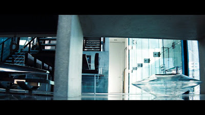
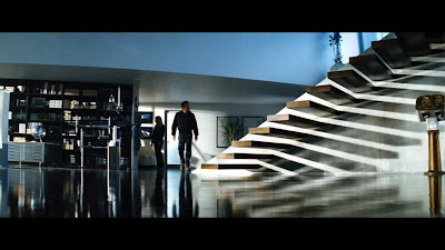
Lots of big empty surfaces, combinations of glossy and rough, matte materials, shades of black, grey and steel is the overall feel of the house. The bare concrete effect overall (seen also in other sets of the film) is one of my favourites. An impressive staircase with singular massive steps jutting out of the wall is the main attraction of the living room area.

The living room area has massive windows, minimal furniture (as all over the house) and impressive accessories.

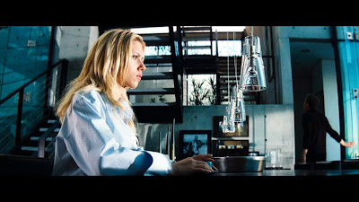
There is a big (stone?) table nearby, it looks like a dining room but it could be an extension of the kitchen counter doubling as a table. We will see the dining table later on.


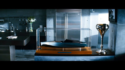
Everything inside has been picked very carefully to match the overall set. The art director did a wonderful job with this. Look at the trophy and the boat model...

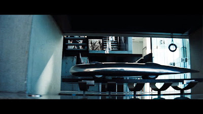
...or the car model in a wall opening. Bare concrete seems to be everywhere.

It also shows up here, the view is from the stairs further up the house, going onto the second level. This whole thing looks like a minimalistic fireplace without the fire.

The dining table is black (surprise!) with the classic multi-light fixture in a linear setting above it.

There is of course a large book case, seen at the back of the photo...

...and closer here...

No bachelor pad would be complete without a high-tech media centre.

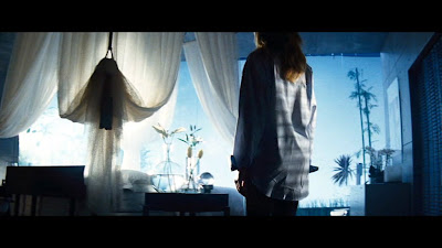
Going upstairs, we can see the bedroom, decorated in a romantic way, a bit strange for a bachelor pad, with a very impressive curtain.

There is also a modern walk in closet, with backlit walls. I could not get a decent capture of that. There is also a nice sideboard in the bedroom.

The corridor upstairs is without a rail, making it extremely un-safe...

The upper part of the stairs is more typical modern...

...with the bottom part in total contrast. I can never figure if it is the same staircase, changing after the first flight of steps, or there are two stairs in the house.

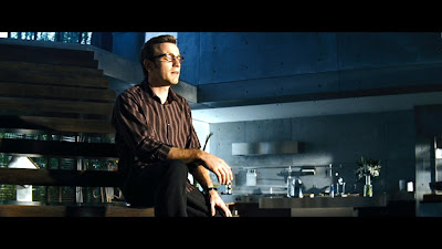
The kitchen is in steel and stone, making it very industrial looking and sleek.

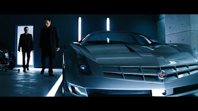
Finally the garage is bare and minimal, with light incorporated into the wall and floor. The car inside looks like a million bucks.

And the credits for all this excellent work:

Production design by Nigel Phelps

Art Direction by Jon Billington, Sean Haworth and Martin Whist

Set Decoration by Rosemary Brandenburg

Thursday, November 15, 2007

DIY: Quirky curtain rod

Saw this today in Apartment Therapy, through Do It Yourself: A curtain rod made with a real tree branch.


The trick is to find a really great looking branch and also for it to be the right size for the door/window. Then it has to be pruned properly, but not completely, so that it will be dramatic enough. When you are satisfied with the final shape, spray-paint it in a contrasting colour to your wall, but matching with curtains and/or window trim. Use brackets to hang it to the wall, and paint them with the same colour. The best type of curtain for this is a top-tying one. Of course you have to put this in a window/door that does not open much. Also have in mind that the curtain will have minimum movement.

Wednesday, November 14, 2007

48th Thessaloniki International Film Festival


The International Film Festival is the biggest cultural event each year in Thessaloniki. All the film industry professionals of the country, and many from abroad, gather in my hometown to celebrate the art of making films.


The minimally designed poster (above) is the number 48 turned on the side to resemble a camera. It must be the most minimally designed poster in the history of the festival. I like it though, it has style and impact and immediately reminds you of film, which is what it is supposed to do.

I am thinking that, starting on Friday, I could make posts about films where interior design plays a big part. So come by again tomorrow night to see the first one.


For more info about the 48th Thessaloniki International Film Festival see here.