Saturday, November 26, 2011

Bernard Kesselring, designer of our memories

Bernard Kesselring was born in Auvernier (Neuchâtel) in 1934. He grew up in Switzerland and France and studied at the Agricultural School of Bordeaux, in France, leaving after graduation for a sojourn in Scandinavia, working as a lumberjack and miner. That surely does not fit with what he did next: he enrolled at the Zurich college of Applied Arts, where he studied graphic, industrial and interior design, getting a bachelor in design. He then launched into a career in design, working as a freelancer in Zurich, mostly around industrial and graphic design but also doing lots of exhibition design. He also did a bit of modelling, as his looks were a magnet for photographers and got cast in many ads.


From a photo session for an advertisement, Bernard Kesselring is the man standing at the back looking at us. Mad Men art director would have a field day with this photo!


From an advertising photo session.


Bernard as a drummer


In 1963 he arrived in Athens, working for various advertising agencies such as Kousentos and Delta Delta Dimou. He also dabbled in interior design, collaborating with architect George Vallatas. In 1967 he became Creative Director of the advertising department of detergent and soap manufacture F. Steinfels A.G., in Zurich. There he was responsible for new product development, its packaging design, everything that had to do with the marketing, advertising campaigns and television advertisement production for Steinfels products. He created Bio (from bio-degradable, bio-friendly), the little guy you see above (in b&w) and below (in 3D colour), to advertise their products, as well as Softy (Bio's wife and the face of a fabric softener), another cartoon character.


After a stint as Creative Director with the Norman, Craig & Kummel Advertising Agency in Zurich, and some years as freelancer, he returned to Athens, first working as the Creative Director of Olympic-Euro advertising agency, then setting up his own company, Swissdesign and later Swissad. He designed some of the most memorable logos of my childhood, logos that we kept seeing everyday in front of us, either on household products or in print and TV advertisements: Ouzo 12 (which became an international Greek brand identity - the logo was used as he designed it for 30 years, but they recently changed the font, using a dreadful serif one), AVA dish-washing liquid, ELCO-Vagionis, Varanghis, Miss Pat, Balco/Orca, Molokotos yarns, ROLI detergent packaging and others. He also devised the ROL detergent slogan: "Greece loves white. Greece loves ROL" which was a mainstay of their ad campaigns for years, as was his other successful slogan, for PRODERM products: "tender care and Proderm" which still defines a generation in Greece and is used in Greek slang to denote tenderness either in earnest or in irony.


The AVA logo is still used as he designed it, ingenious idea to put the liquid drop at the middle of the letter V


In the early 80s he became associate Creative Director at Ikon/BBDO Advertising in Athens, then started working as a freelance designer. He later moved to Crete, where he still works as a designer, builds hand-made wooden furniture and renovates traditional stone-built houses. I consider myself really lucky to have as a friend his wonderful and very talented daughter Eva, who turned me on to this stuff and gave me the opportunity to present them to you. It made me relive part of my childhood - happy memories indeed. Thank you Mr. Kesselring.

Saturday, November 05, 2011

Tribute to Loulou De La Falaise, one of the most elegant women in the world

What can one write about a woman christened with a bottle of Sciaparelli's Shocking perfume instead of holy water? An unconventional personality, always chic in her own, inimitable way, the personification of what French chic means to the world, Loulou De La Falaise was the eternal Yves Saint-Laurent muse, his good friend and collaborator. And one of my very favourite and loved women in fashion.


Loulou (full name: Louise Vava Lucia Henriette de Le Bailly de la Falaise) was born in 1948, into one of France's most artistic and bohemian families: daughter of Alain, Count Le Bailly De La Falaise, writer, translator and heir to the Henessy cognac fortune, and Maxime Birley, English beauty and model (Beaton said she was "the only true chic Englishwoman"), she had quite a formidable clan to inspire her. Her maternal grandfather was painter Sir Oswald Birley, her uncle Mark Birley (of Annabel's fame), a great uncle, director Henri De La Falaise (3rd husband of Gloria Swanson), brother Alexis, an interior designer, niece Lucie (a model and also muse for YSL) and nephew Daniel (a chef and model). She also married into art: her 2nd husband was artist Thadée Klossowski de Rola, a son of the famous French painter Balthus. They had a daughter, Anna. What a pack!


Expelled from three boarding schools, she went to New York, where Diana Vreeland put her into modelling. She hated the job and returned to London, where she worked as a fashion editor for Queens. In 1968, she met Yves Saint-Laurent. She started working with him in 1972 and stayed with him in YSL for thirty years, until he retired. She helped with jewellery and accessories design, also becoming his right hand at work. Her incredible sense of styling inspired him. She however disiked the "muse" label:  "I used to get very irritated by that term. For me, a muse is someone who looks glamorous but is quite passive, whereas I was very hard-working. I worked from 9am to sometimes 9pm, or even 2am. I certainly wasn't passive. I worked on jewellery and knitwear, on the in-between collections. Now that it's all over, I like to think there's a bit of my soul in the clothes that were designed when I was there because I was supposed to be a source of inspiration." After Saint-Laurent retired, she created her own brand of jewellery and accessories.


Loulou was the gupsy influence, the over the top look for Yves, while Betty Catroux was his inspiration for the more masculine styles. The formidable trio created a unique look and feel for the French label, cementing what for many is still considered the epitome of Parisian style. Her trademark style: pants most of the time - made of velvet, shantung or silk - paired with satin tops in bright colours, chiffon blouses, simple black sweaters, printed or brocade jackets. She loved combining different patterns, for example striped pants and a Madras blazer with a classic white shirt. And of course the jewellery: bracelets and necklaces, often multi-stranded and made of semiprecious stones, with a multi-ethnic vibe. It remained constant but never dated, throughout her life: "I never think much of my age, I just get dressed and wear things that suit me at the moment." 


She died on the 5th of November, after a long illness according to a press release by the Pierre Berge - Yves Saint-Laurent Foundation. She will always be an inspiration and influence.

Friday, October 07, 2011

Design tribute to Steve Jobs (February 24, 1955 – October 5, 2011)

As a tribute to Steve Jobs I decided, instead of writing one more thing among the many written about him, to just make a visual design tribute to him, through the things he was instrumental into bringing to the world, affecting many people, in the way they live their everyday lives but also their aesthetics.


Friday, September 16, 2011

Thessaloniki Metro stand at 76th International Fair, by Tetragon Ltd.

This is the third time Tetragon design the stand of Thessaloniki Metro. Winning the tender of the particular competition is not easy, as all major competitor companies from Greece vie for it. The reason is not only the relatively high budget of the project, but mainly the chance to deliver a modern, sophisticated design with elements usually not found in other exhibits featured in Thessaloniki International Fair.


This time the concept was more ambitious then before: first of all there is a clear separation of the stand space, by colour blocking, into two distinct areas: the reception and media area, in anthracite grey and the display area, all in white. All these are framed by a hanging L-shaped ceiling element, with recessed lighting. The result is surprisingly minimal but imposing.

The map of the main Metro line, as well as the future expansions, is always the main display of the stand. This year it was put on a reclining table, emerging from the floor as if being peeled away, revealing the ground below it, a direct reference to the excavations of the Metro taking place throughout the city. Lava pellets were used instead of soil, giving a brilliant earthen colour. Through it, three 17" screens emerge, projecting slide-shows of ancient artefacts discovered in the excavations. The map itself is printed on backlit canvas. On its left a literature holder contains the company's brochure.


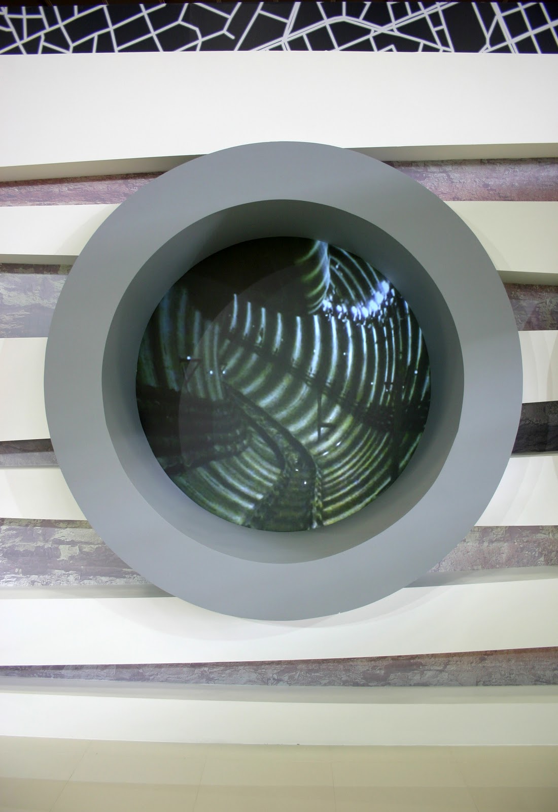
The main attraction of the stand is the display behind the map. A geometric simulation of the two distinct tunnels of the main line (one for each direction) becomes a double back projection of a film made in the real tunnels (footage was shot by me, the editing done by Icon 4D), giving a chance to the public to catch a glimpse of what is going on under their feet. One can see the TBM at work as well, an imposing spectacle indeed (and one of the best experiences this work has ever given me). The "tunnels" are set on a wall featuring inclined white beams, with a printed soil section photo set between them, giving a sense of them being actually underground.


To complete the media onslaught, a set of 2X2 seamless LED screens feature a small video showing footage with various works in three different stations of the main line, Railway Station, University Station and Euclides Station. I was lucky enough to visit all three and film footage for the video there. In this area, the reception is located, right across the stand from the screens, with a display featuring the lava pellets and the miniature safety helmets of the Metro workers, given as a memento at the stand.


The graphics are simple: there is a huge print of the city's grid plan in black and white that starts from the front of the stand and goes on covering part of the back walls. On this plan, another map, a simple geometric layout of the main line and expansions is featured, as well as a sign with the parent company's (Attiko Metro) name on it. A similar background is used for the back side canvas cover, made at the last minute, when we found out that it would remain empty as no other stand would be erected behind it. Three backlit columns frame the right side of the stand, featuring photos at various work-sites of the Thessaloniki Metro. I designed these, making a jagged line to separate the photos, alluding to the letter "M" of the Metro but also giving a hint of a pulse sign, alluding to the activity of the sites. 


The stand was designed by architect Ilias Papadopoulos, one of the three Tetragon Ltd. partners. The stand was constructed by Tetragon Ltd. Film footage for the stand media, slideshow production and graphics by Stratos Bacalis for Tetragon Ltd. Video editing and production by Icon 4D. Audiovisual equipment by M-Spirit. Graphics printed and placed by Whale Graphics. Stand photos courtesy of Stratos Bacalis.


Saturday, July 09, 2011

Historical Museum of Alexandroupolis

Alexandroupolis is one of the newest cities of Greece. Created in late 19th century from the settlements of French and Turks employees of their respective railroad companies. It was first known as Dedeagatch based on a local tradition of a wise dervish having spent much of his time in the shade of a local tree and being eventually buried beside it.


The city went through a varied and tumultuous history, renamed Alexandroupolis in honour of King Alexander I of Greece in 1920 (not Alexander the Great of course). A port and the last Greek city before the Turkish borders, situated near the Evros river delta, it is a city filled with life. Tetragon has special ties to it, having already had lots of projects done there (the Natural History Museum in the delta, the Lighthouse square) and was picked to design and construct the city's history museum, established through a local association of history buffs and collectors. 


The Historical Museum of Alexandroupolis' permanent exhibit takes up a whole floor of the building in which the museum is housed. It guides the visitor through the area's and city's history, from ancient times till now. With the help of interactive displays, audiovisual equipment and the incredible archive it houses, it helps one learn many things about the city and its history, particularly learn about its people.


The museum is situated on the city's main street, right across the city hall. I am proud to have taken part into making its main exhibit a reality. (Photos courtesy of Stratos Bacalis)