Showing posts with label Thessaloniki International Fair. Show all posts

Friday, September 16, 2011

Thessaloniki Metro stand at 76th International Fair, by Tetragon Ltd.

This is the third time Tetragon design the stand of Thessaloniki Metro. Winning the tender of the particular competition is not easy, as all major competitor companies from Greece vie for it. The reason is not only the relatively high budget of the project, but mainly the chance to deliver a modern, sophisticated design with elements usually not found in other exhibits featured in Thessaloniki International Fair.


This time the concept was more ambitious then before: first of all there is a clear separation of the stand space, by colour blocking, into two distinct areas: the reception and media area, in anthracite grey and the display area, all in white. All these are framed by a hanging L-shaped ceiling element, with recessed lighting. The result is surprisingly minimal but imposing.


The map of the main Metro line, as well as the future expansions, is always the main display of the stand. This year it was put on a reclining table, emerging from the floor as if being peeled away, revealing the ground below it, a direct reference to the excavations of the Metro taking place throughout the city. Lava pellets were used instead of soil, giving a brilliant earthen colour. Through it, three 17" screens emerge, projecting slide-shows of ancient artefacts discovered in the excavations. The map itself is printed on backlit canvas. On its left a literature holder contains the company's brochure.


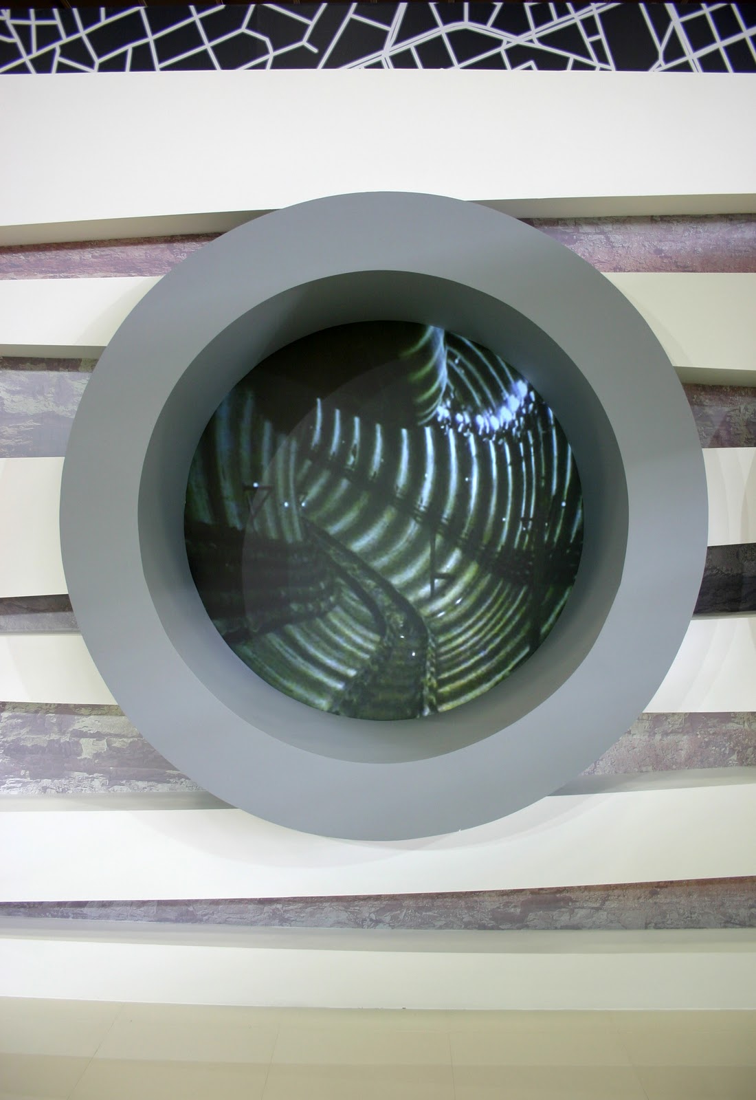
The main attraction of the stand is the display behind the map. A geometric simulation of the two distinct tunnels of the main line (one for each direction) becomes a double back projection of a film made in the real tunnels (footage was shot by me, the editing done by Icon 4D), giving a chance to the public to catch a glimpse of what is going on under their feet. One can see the TBM at work as well, an imposing spectacle indeed (and one of the best experiences this work has ever given me). The "tunnels" are set on a wall featuring inclined white beams, with a printed soil section photo set between them, giving a sense of them being actually underground.

To complete the media onslaught, a set of 2X2 seamless LED screens feature a small video showing footage with various works in three different stations of the main line, Railway Station, University Station and Euclides Station. I was lucky enough to visit all three and film footage for the video there. In this area, the reception is located, right across the stand from the screens, with a display featuring the lava pellets and the miniature safety helmets of the Metro workers, given as a memento at the stand.


The graphics are simple: there is a huge print of the city's grid plan in black and white that starts from the front of the stand and goes on covering part of the back walls. On this plan, another map, a simple geometric layout of the main line and expansions is featured, as well as a sign with the parent company's (Attiko Metro) name on it. A similar background is used for the back side canvas cover, made at the last minute, when we found out that it would remain empty as no other stand would be erected behind it. Three backlit columns frame the right side of the stand, featuring photos at various work-sites of the Thessaloniki Metro. I designed these, making a jagged line to separate the photos, alluding to the letter "M" of the Metro but also giving a hint of a pulse sign, alluding to the activity of the sites. 


The stand was designed by architect Ilias Papadopoulos, one of the three Tetragon Ltd. partners. The stand was constructed by Tetragon Ltd. Film footage for the stand media, slideshow production and graphics by Stratos Bacalis for Tetragon Ltd. Video editing and production by Icon 4D. Audiovisual equipment by M-Spirit. Graphics printed and placed by Whale Graphics. Stand photos courtesy of Stratos Bacalis.


Thursday, September 18, 2008

Tetragon stands at T.I.F. reap awards!

Another Thessaloniki International Fair is behind us (thank God!) and I must say this one was the most subdued and quiet of the ten I have been through as a designer of stands. This year was a big one for the company I work for, Tetragon Ltd., as we had many and prestigious stands designed and constructed. Our efforts were rewarded with the awards and accolades received from the organizer, HELEXPO. But the real award for me is the reactions of our clients and visitors, and they were most excited to see the finished results. Let us see then what we did this year.


And first of all the Attikon Metro (Athens Underground) stand. Of course it was centred around the Thessaloniki Underground line that has just started construction (wonder when it will finish). It was the first time we did their stand. They always have one of the best stands in the fair, so we were up to a challenge. My colleague Ioanna Papadopoulou did an excellent job and I think it was the best stand we had in the fair. Sleek, minimal lines, delineating speed and class. Few colours (mainly white and grey) with the addition of blue, which was originally lime green but changed after a firm "request" came from the Ministry for the Environment, Physical Planning & Public Works. The mirror at the far wall of the stand (where you can see me taking the picture!) combined with the glass wall with the plasma screens enclosed produced a stunning effect.It got an award for best design for indoor stands.


The stand for the Organization for Labour Care was designed by me. I also designed all the graphics that were in it apart from the wave background at the far wall of the stand (the one behind the plexiglass columns and the old ladies). They wanted a seaside feel (graphics - plexiglass mock sails - colours) combined with elements of a playground (colourful "children' furniture) and culture (the plexiglass columns). I think I managed to combine all of them without making it look clumsy and overstuffed. The ceiling has white fabric with back light, to create a nice atmosphere at the TV area, without glare, making it easier to watch the projections. The glass floor you can see was filled with sand, pebbles and sea-shells.


The Institution for Social Security stand was again designed by me (I had done their stand last year too). It was a happy collaboration, with both us and the client very happy throughout. Graphics were designed by my colleague Natasha Masadi. The original colour of the blue wall was lime green (and the floor orange) but the powers that be decided on using blue. The slanted element at the facade is covered with aluminium panels.


The National Telecommunications Organisation stand was a big attraction. Designed by Ilias Papadopoulos, a senior partner in Tetragon, it had an indoors as well as an outdoors stand. The main element was "trees" made of metal and gypsum board, each one designating an area of particular interest i.e. home telecommunications, business solutions, environmental solutions etc. With numerous PC terminals and loads of plasma screens flashing messages to visitors, the stand was teeming with people from day one (you see it empty here as the photos were taken before the opening). It got an award for best design for an outdoor stand.


The Ministry of Education & Religions was designed by my colleague Ioanna Papadopoulou and me (it was a combination of separate designs each one of us made for it) with graphics designed by a collaborator of the Ministry. We tried to take advantage of the positioning of the stand and used the overhang above it to maximum effect (for signage). The 2D globe you see at the last photograph is the new logo of the ministry - the plexiglass disc had a diameter of almost two meters! The orange floor worked well with the white - its reflection on the ceiling made an unexpected effect. It won an accolade.


The Organisation for School Buildings stand was designed by Xenophon Destefanos but built by Tetragon Ltd. They always make conceptual stands and this year was no exception. The main concept of the stand was recycling - the stand looked like a giant used juice carton, with drinking straw, juice and cap complete. Metal statues of children (two kids playing, a biker and a rapper) completed the look, while Pegasus seemed to emerge from the black granite floor. This stand also got an award for design for indoor stand.


The Greek Petroleum-EKO stand is a permanent building within the Fair grounds. This year we got to renovate it from scratch. The result, designed by Ilias Papadopoulos, was a more streamlined and dynamic stand space, equally shared by the two companies. With the right use of graphics it will be able to change look for each future fair. This stand also got an accolade from the organizer.


Greek Sugar Industry stand was designed by another Tetragon senior partner, Eleni Vretzaki. The colours reflect the ones from the sugar packages familiar to all Greeks while the general look of the stand is minimal and organic, fitting to the client. One of the main decorative elements was an oversize reproduction of a sugar beet plant in plexiglass, with real ones placed on the grass around it! This stand got also an accolade from the organizer.

Thursday, September 20, 2007

Stands at Thessaloniki International Fair 2007

I designed some stands at Thessaloniki International Fair. One of them even got an award as best designed stand in an enclosed space. Here they are:

The stand for the Information Society is the awarded one! I designed originally five different approaches to it, then they narrowed it down to one and a colleague took over while I was on holiday, doing the necessary changes and alterations until we reached the final result.

photo by Dinos Michail

photo by Dinos Michail

Then there was the stand for the Hellenic Sugar Industry. Here I took a design of a colleague he had done for them last year and revamped it, adding also the bubble display at the right side of the stand. Pity they did not let us do the set up of their products inside the acrylic bubbles, the result would have been much better.

photo by Dinos Michail

photo by Dinos Michail

Here is the stand I designed for IKA (Social Insurance Institute). This is my favorite stand this year - too bad the client made us change the 3X3 plasma screen display on the right wall and replace it with a single 60" LCD screen.

photo by Dinos Michail


The stand for three of the institutes of the Ministry of Employment and Social Protection had some difficulties in the layout, considering two of the institutes had only a 2,5m front and that they had to follow the general look of the Ministry we had established with the IKA stand and the OEE stand (designed by a colleague). The final result is modern and colorful, unlike the image one has in mind regarding state institutions.

photo by Dinos Michail


Because of the devastating fires in Greece, the Ministry of Economics canceled their participation. HELEXPO decided to devote the space left to a stand dedicated to gathering aid for the people hit by the disaster. In a limited amount of time we had to come up with an idea for it and this is the result:

photo by Dinos Michail

photo by Dinos Michail

The concept was that we had to give a sense of the devastation and despair the fires cased, while at the same time sending a message of hope for the future and the environment. Thus the black color prevailed, while the graphics, designed by my very talented colleague Zoi Gazila, showed lovely images of the forests (by Dinos Michail) accompanied by verses of Greek poets relevant to the theme. A different word on each of the eight towers in the stand, connected to the concept of help and compassion and hope, acted as the marker.