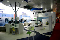
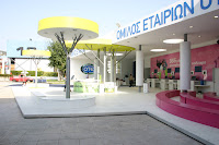
CARTECO, one of the leading importers of decorative and architectural materials and furniture in Greece, has made a bold move in the course of perfecting its collaboration with designers and architects. THE ARCHIVE, opening in Thessaloniki first (Mitropoleos Street 127), will be a library of materials, architectural solutions and decoration that will also work as an exhibition space for architecture.
In a space of no more than 25 square meters, THE ARCHIVE collects most necessary tools for an architect in the realization of his/her projects. A big library of catalogues and samples from CARTECO and its collaborators, up to date publications from Greece and abroad about architecture, industrial design and graphic design, three I-mac computers with free Internet access as well as a projector connected to a computer available to the user for programmed presentations or free use of it for presentations to clients or colleagues or even a student presenting his thesis. There is also a WI FI spot with free fast Internet access so that the user can connect his own computer and work there. Dock stations for I-pods are also available - you can listen to your favourite music while working there too!
THE ARCHIVE is available 24 hours a day, with the use of a personalized entrance card. This card will be provided without charge to anyone interested, them of course being architects or designers or of relative field. This unique and breakthrough idea is a product of the never ending efforts of CARTECO to assist architects, interior designers and the design community, by giving them a sense of freedom for creativity, inspiration, study and work. THE ARCHIVE aspires to become a dynamic meeting point for creative people in the city, as through a series of events programmed throughout the year, it will keep in touch with Greek and international developments in architecture and design. So go get yourself a card, I have already registered!
THE ARCHIVE is the result of a creative team working alongside the vision of Vassilios P. Bartzokas, CEO of CARTECO. The space was designed by architects Katerina Kotzia and Korina Filoksenidou, while all communication design, environmental graphics and press items were designed by mnp.
THE ARCHIVE website was designed by beetroot design group. You can find more information there and also apply on-line for your entrance card. The site will soon be fully functional.
As mentioned earlier, guided by the wish to become a point of reference for the architects and designers of the city, THE ARCHIVE through “THE ARCHIVE episodes” will host a number of architectural events during the year. The premier episode will launch in October in coordination with the project “Athens by Sound”- Official Greek Participation in the 11th Biennale of Architecture in Venice, curated by Anastasia Karandinou, Christina Achtypi and Stylianos Giamarelos.
The “Athens by Sound” team will declare its presence in Thessaloniki inaugurating THE ARCHIVE episodes with a sound installation. Parallel to the exhibition in Venice and always in accordance with their project, the curators will bring selected Venice sounds to the city. The architectural event will begin in October along with the official opening of THE ARCHIVE, and will last until the end of the Venice Biennale on November 23rd.
P.S. Check out the Flickr photo set of the space in Thessaloniki.
Tuesday, September 30, 2008
Tuesday, September 23, 2008
What am I doing in Muzine 5?
One of my favourite magazines, Muzine, has released its 5th issue. It was supposed to be the summer one but it comes out in September - better late than never. Happily it deserves the wait.
The magnificent cover gives you a taste of what comes inside. First of all an amazing tribute to the connection of films and music called "MUZINEMA". Movies and records with the same title are presented/reviewed by the editors while they also try to find their real or imaginary connection. The incredible T-drom illustrates this whole section brilliantly. Next a touching interview and review of Scott Matthew by Markos Fragkos, followed by an equally excellent interview and review of Tom Baxter and his new release by Eleni Mitsiaki. Enteka writes his "They once said..." column, Christos Karras interviews the multitalented Spyweirdos, Aggelos K interviews a group from Thessaloniki called Your Hand In Mine, while Eleni Mitsiaki writes them a great review. Many other reviews from all the editors of the magazine are included (The Long Blondes, Adele, The Futureheads, Pale Young Gentlemen, Unforscene etc., my favourite ones by Makis Papasimakopoulos, Loan Me A Dime and Markos Fragkos) and of course the usual top-5 selections and many more articles. You can also see illustrations of talented Vassilis Bibas and Pan Pan, along with the regular Batonetta comic by Vassilis Kolettis and Stavros Dillios.
So what about the title of the post? you will ask. Well, Eleni Mitsiaki asked me, when she wrote her short story inspired by the collection "Watermark", edited by Maria Paroussi for EMI, if I could illustrate it. I know she can write amazing stuff, and reading it was no exception. I immediately said yes, fearing only I might not be able to do justice to her words. She and Muzine's publisher happily accepted the illsutration and you can see the result above this paragraph.
Muzine #5 cover designed by ellij
The magnificent cover gives you a taste of what comes inside. First of all an amazing tribute to the connection of films and music called "MUZINEMA". Movies and records with the same title are presented/reviewed by the editors while they also try to find their real or imaginary connection. The incredible T-drom illustrates this whole section brilliantly. Next a touching interview and review of Scott Matthew by Markos Fragkos, followed by an equally excellent interview and review of Tom Baxter and his new release by Eleni Mitsiaki. Enteka writes his "They once said..." column, Christos Karras interviews the multitalented Spyweirdos, Aggelos K interviews a group from Thessaloniki called Your Hand In Mine, while Eleni Mitsiaki writes them a great review. Many other reviews from all the editors of the magazine are included (The Long Blondes, Adele, The Futureheads, Pale Young Gentlemen, Unforscene etc., my favourite ones by Makis Papasimakopoulos, Loan Me A Dime and Markos Fragkos) and of course the usual top-5 selections and many more articles. You can also see illustrations of talented Vassilis Bibas and Pan Pan, along with the regular Batonetta comic by Vassilis Kolettis and Stavros Dillios.
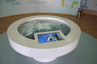
So what about the title of the post? you will ask. Well, Eleni Mitsiaki asked me, when she wrote her short story inspired by the collection "Watermark", edited by Maria Paroussi for EMI, if I could illustrate it. I know she can write amazing stuff, and reading it was no exception. I immediately said yes, fearing only I might not be able to do justice to her words. She and Muzine's publisher happily accepted the illsutration and you can see the result above this paragraph.
Thursday, September 18, 2008
Tetragon stands at T.I.F. reap awards!
Another Thessaloniki International Fair is behind us (thank God!) and I must say this one was the most subdued and quiet of the ten I have been through as a designer of stands. This year was a big one for the company I work for, Tetragon Ltd., as we had many and prestigious stands designed and constructed. Our efforts were rewarded with the awards and accolades received from the organizer, HELEXPO. But the real award for me is the reactions of our clients and visitors, and they were most excited to see the finished results. Let us see then what we did this year.
And first of all the Attikon Metro (Athens Underground) stand. Of course it was centred around the Thessaloniki Underground line that has just started construction (wonder when it will finish). It was the first time we did their stand. They always have one of the best stands in the fair, so we were up to a challenge. My colleague Ioanna Papadopoulou did an excellent job and I think it was the best stand we had in the fair. Sleek, minimal lines, delineating speed and class. Few colours (mainly white and grey) with the addition of blue, which was originally lime green but changed after a firm "request" came from the Ministry for the Environment, Physical Planning & Public Works. The mirror at the far wall of the stand (where you can see me taking the picture!) combined with the glass wall with the plasma screens enclosed produced a stunning effect.It got an award for best design for indoor stands.
The stand for the Organization for Labour Care was designed by me. I also designed all the graphics that were in it apart from the wave background at the far wall of the stand (the one behind the plexiglass columns and the old ladies). They wanted a seaside feel (graphics - plexiglass mock sails - colours) combined with elements of a playground (colourful "children' furniture) and culture (the plexiglass columns). I think I managed to combine all of them without making it look clumsy and overstuffed. The ceiling has white fabric with back light, to create a nice atmosphere at the TV area, without glare, making it easier to watch the projections. The glass floor you can see was filled with sand, pebbles and sea-shells.
The Institution for Social Security stand was again designed by me (I had done their stand last year too). It was a happy collaboration, with both us and the client very happy throughout. Graphics were designed by my colleague Natasha Masadi. The original colour of the blue wall was lime green (and the floor orange) but the powers that be decided on using blue. The slanted element at the facade is covered with aluminium panels.
Greek Sugar Industry stand was designed by another Tetragon senior partner, Eleni Vretzaki. The colours reflect the ones from the sugar packages familiar to all Greeks while the general look of the stand is minimal and organic, fitting to the client. One of the main decorative elements was an oversize reproduction of a sugar beet plant in plexiglass, with real ones placed on the grass around it! This stand got also an accolade from the organizer.
And first of all the Attikon Metro (Athens Underground) stand. Of course it was centred around the Thessaloniki Underground line that has just started construction (wonder when it will finish). It was the first time we did their stand. They always have one of the best stands in the fair, so we were up to a challenge. My colleague Ioanna Papadopoulou did an excellent job and I think it was the best stand we had in the fair. Sleek, minimal lines, delineating speed and class. Few colours (mainly white and grey) with the addition of blue, which was originally lime green but changed after a firm "request" came from the Ministry for the Environment, Physical Planning & Public Works. The mirror at the far wall of the stand (where you can see me taking the picture!) combined with the glass wall with the plasma screens enclosed produced a stunning effect.It got an award for best design for indoor stands.
The stand for the Organization for Labour Care was designed by me. I also designed all the graphics that were in it apart from the wave background at the far wall of the stand (the one behind the plexiglass columns and the old ladies). They wanted a seaside feel (graphics - plexiglass mock sails - colours) combined with elements of a playground (colourful "children' furniture) and culture (the plexiglass columns). I think I managed to combine all of them without making it look clumsy and overstuffed. The ceiling has white fabric with back light, to create a nice atmosphere at the TV area, without glare, making it easier to watch the projections. The glass floor you can see was filled with sand, pebbles and sea-shells.
The Institution for Social Security stand was again designed by me (I had done their stand last year too). It was a happy collaboration, with both us and the client very happy throughout. Graphics were designed by my colleague Natasha Masadi. The original colour of the blue wall was lime green (and the floor orange) but the powers that be decided on using blue. The slanted element at the facade is covered with aluminium panels.
The National Telecommunications Organisation stand was a big attraction. Designed by Ilias Papadopoulos, a senior partner in Tetragon, it had an indoors as well as an outdoors stand. The main element was "trees" made of metal and gypsum board, each one designating an area of particular interest i.e. home telecommunications, business solutions, environmental solutions etc. With numerous PC terminals and loads of plasma screens flashing messages to visitors, the stand was teeming with people from day one (you see it empty here as the photos were taken before the opening). It got an award for best design for an outdoor stand.
The Ministry of Education & Religions was designed by my colleague Ioanna Papadopoulou and me (it was a combination of separate designs each one of us made for it) with graphics designed by a collaborator of the Ministry. We tried to take advantage of the positioning of the stand and used the overhang above it to maximum effect (for signage). The 2D globe you see at the last photograph is the new logo of the ministry - the plexiglass disc had a diameter of almost two meters! The orange floor worked well with the white - its reflection on the ceiling made an unexpected effect. It won an accolade.
The Organisation for School Buildings stand was designed by Xenophon Destefanos but built by Tetragon Ltd. They always make conceptual stands and this year was no exception. The main concept of the stand was recycling - the stand looked like a giant used juice carton, with drinking straw, juice and cap complete. Metal statues of children (two kids playing, a biker and a rapper) completed the look, while Pegasus seemed to emerge from the black granite floor. This stand also got an award for design for indoor stand.
The Greek Petroleum-EKO stand is a permanent building within the Fair grounds. This year we got to renovate it from scratch. The result, designed by Ilias Papadopoulos, was a more streamlined and dynamic stand space, equally shared by the two companies. With the right use of graphics it will be able to change look for each future fair. This stand also got an accolade from the organizer.
Sunday, September 14, 2008
My "art"...
I did three paintings as gifts for a friend - well, not exactly paintings with brushes, but anyway... I started with a photo portrait of him by me, digitally worked with it in Adobe Photoshop and Corel Photo Paint and made two distinct works out of it, one looking like an illustration, in colour, the other in black and white, much like the Audrey Hepburn portrait, sold in IKEA, made by Phil Handsley. And then I tried the same technique on my friend's favourite photograph: a Helmut Newton portrait of Isabella Rosselini and David Lynch. The colour illustration has a background that was made by another of my photos, again touched up in Photoshop. I printed them on canvas sized 90X90 cm with material left to do the inside framing easily. Let me know what you think.
Subscribe to:
Posts (Atom)