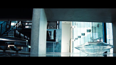
Lots of big empty surfaces, combinations of glossy and rough, matte materials, shades of black, grey and steel is the overall feel of the house. The bare concrete effect overall (seen also in other sets of the film) is one of my favourites. An impressive staircase with singular massive steps jutting out of the wall is the main attraction of the living room area.
 The living room area has massive windows, minimal furniture (as all over the house) and impressive accessories.
 There is a big (stone?) table nearby, it looks like a dining room but it could be an extension of the kitchen counter doubling as a table. We will see the dining table later on.
Everything inside has been picked very carefully to match the overall set. The art director did a wonderful job with this. Look at the trophy and the boat model...
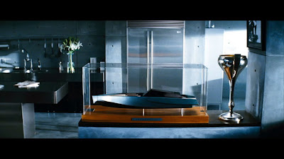 ...or the car model in a wall opening. Bare concrete seems to be everywhere.
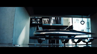 It also shows up here, the view is from the stairs further up the house, going onto the second level. This whole thing looks like a minimalistic fireplace without the fire.
 The dining table is black (surprise!) with the classic multi-light fixture in a linear setting above it.
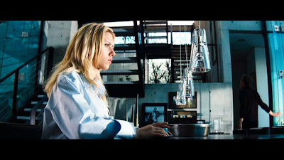 There is of course a large book case, seen at the back of the photo...
 ...and closer here...
 No bachelor pad would be complete without a high-tech media centre.
 Going upstairs, we can see the bedroom, decorated in a romantic way, a bit strange for a bachelor pad, with a very impressive curtain.
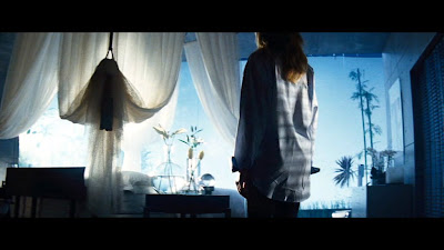 There is also a modern walk in closet, with backlit walls. I could not get a decent capture of that. There is also a nice sideboard in the bedroom.
 The corridor upstairs is without a rail, making it extremely un-safe...
 The upper part of the stairs is more typical modern...
 ...with the bottom part in total contrast. I can never figure if it is the same staircase, changing after the first flight of steps, or there are two stairs in the house.
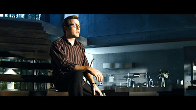
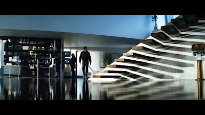 The kitchen is in steel and stone, making it very industrial looking and sleek.
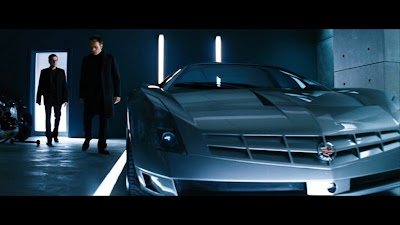
 Finally the garage is bare and minimal, with light incorporated into the wall and floor. The car inside looks like a million bucks.
 And the credits for all this excellent work:
Production design by Nigel Phelps
Art Direction by Jon Billington, Sean Haworth and Martin Whist
Set Decoration by Rosemary Brandenburg
Γεια σου καλέ μου φίλε!!
ReplyDeleteΚάθε φορά που μπαίνω στο blog σου "χαζεύω" και όπως ξέρεις δεν είναι ο τομέας μου!
Γι'αυτό έχουμε εσένα, ε!
ΚΑΛΗ ΒΔΟΜΑΔΑ,
θα τα πούμε (ΚΑΙ) στο τηλέφωνο!
Nice post and interesting blog.
ReplyDeleteallicblog
Thanks!
ReplyDeleteI am about to construct an entertainment complex in Philadelphia and I was referencing the Island to everyone involved so they can see where I got my idea to go with concrete. However, I am attempting to think on how to insulate a large building since we're in NE USA.
ReplyDeleteI am about to construct an entertainment complex in Philadelphia and I was referencing the Island to everyone involved so they can see where I got my idea to go with concrete. However, I am attempting to think on how to insulate a large building since we're in NE USA.
ReplyDeleteTry hiring an architect who understands the thermal envelope of a building, instead of "attempting to think" about it.
Delete@Jimtdavis: you should try putting the insulation within the concrete walls.
ReplyDeleteWho is the architect of the home and where is it located?
ReplyDeleteIt is a film set, not an actual house.
DeleteIn the doctor's office, is that a Picasso?
ReplyDelete